Chapter 4 SPECT Processing, Quantification, and Display
OBLIQUE REORIENTATION AND RESLICING
Although the original tomograms obtained by reconstructing raw data from positron emission tomography (PET) and SPECT scanners are in a transaxial orientation, cardiac images are generally viewed in different formats consisting of short-axis, horizontal long-axis, and vertical long-axis slices. Short-axis slices are also necessary for some automatic perfusion quantification algorithms, and determination of functional parameters can depend upon accurate reorientation.1 Generation of these standard sections from the original transaxial images used to be performed interactively, requiring the user to mark the location of the left ventricular (LV) axis. In the past few years, automatic techniques for performing this task have been described and are commercially available.2–4
Two approaches2,3 for automatic reorientation start by identifying the LV region in the transaxial images, using a threshold-based approach that includes knowledge about expected position, size, and shape of the LV. Once isolated, the approach described by Germano et al.2 uses the original data to refine the estimate of the myocardial surface. Normals to an ellipsoid fit to the LV region are used to resample the myocardium; a Gaussian function is fit to the profiles obtained at each sample. The best fit Gaussian is used to estimate the myocardial center for each profile, and after further refinement based on image intensities and myocardial smoothness, the resulting mid-myocardial points are fitted to an ellipsoid whose long axis is used as the final LV long axis. The method was tested on 400 patient images and the result compared to interactively denoted long axes. Failure of the method was described as either not localizing the LV, presence of significant hepatic or intestinal activity in the LV region of the image, or greater than 45(o) difference between automatically and interactively determined axes. With these criteria, the method was successful in 394 of the 400 cases.
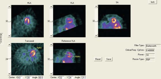
Faber et al.3 also use the expected size and location of the heart in the image to isolate the ventricles. They then use a search algorithm to find the best axis of symmetry in the transaxial plane by reflecting the image about this axis and subtracting the result from the original slices. To improve comparisons in the case of reduced perfusion, the image is normalized separately on each side of the axis being tested. Once the best axis on the transaxial slice is located, the image is resliced parallel to this axis, and the process is repeated using the resulting near-sagittal images. This method was applied to 25 rest and stress studies; automatic center and axis angles were compared to those chosen by an expert, and the difference in quantitative results resulting from the automatic and interactive reorientation were evaluated. The average absolute mean difference between the interactively and automatically chosen horizontal long-axis angles was 6.3 ± 5(o). The average absolute mean difference between the interactively and automatically chosen veritcal long-axis angles was 5.7 ± 4.2(o). In addition, using the quantitation following interactively chosen reorientation angles as the gold standard, the automatic reorientation resulted in an accuracy of 92% for diagnosing coronary artery disease (CAD). Example results from this method can be seen in Figure 4-1.
Slomka et al.4 take a different approach entirely to automated reorientation. Their method registers the original image data to a “template” image in which the orientation of the LV is known and standardized. The template is created by averaging a large number of registered, normal patient data sets, and a separate template is created for males and females. The registration is done by first translating and scaling the image based on principal axes; the match is refined by minimizing the sum of the absolute differences between the template and the image being registered. This method was not compared to interactively reoriented images, but it was evaluated visually for 38 normal and 10 abnormal subjects and found to be successful for all.
MOTION CORRECTION (See Chapter 5)
Patient or organ motion during SPECT scanning can cause small image artifacts in the best case and make the scan unreadable in the worst case. A good overview of the effects of motion and how to detect them are given by Fitzgerald and Danias.5 Most manufacturers now provide automatic motion correction algorithms that account for a patient moving during the acquisition. One early approach by Cooper et al.6 attempted to determine the position change of the heart in the sinograms and correct for this. This method, along with manual correction, was found by O’Conner et al.7 to be particularly effective in removing various kinds of patient movement in a phantom study. More recently, a motion correction technique has been introduced that is based on the operation of making projections or sinograms more consistent with the reconstruction.8 From the original data, a reconstruction is created. New projections are computed using the original reconstruction and compared to the original projections. Each original projection is aligned with the new projections created from the reconstruction. The registered projections are reconstructed again to create a new starting reconstruction, and the process is iterated until the registered original projections match the reprojections of the reconstruction created from them. This occurs when the data sets are consistent (i.e., when the motion artifacts are removed from the projections through the iterative alignment). An evaluation of this approach was published by Matsumoto et al.9 The importance of motion correction on both slices and quantitative results is demonstrated in Figure 4-2.
AUTOMATED PERFUSION QUANTIFICATION
Data-based methods for identifying a patient’s myocardial perfusion abnormalities from thallium (Tl)-201 SPECT studies have been previously developed and commercialized by investigators at Cedars-Sinai Medical Center10 and Emory University11 and reported as early as 1985. More recently, these methods have been widely used by various investigators to quantify myocardial perfusion SPECT studies imaged using technetium 99mTc-based agents. These methods utilize a statistically defined database of normal (and abnormal) patients to be used as a pattern to compare prospective CAD patients. These methods have been extensively validated12 and proven to be clinically valuable12 in standardizing and objectifying13 myocardial perfusion scans. These validations have shown that in stable patients having serial perfusion studies, quantification is more reproducible than the visual interpretation of experts for determining the magnitude of the perfusion abnormality.13 This improved reproducibility of quantitative techniques over visual analysis promotes the need for the use of quantification in randomized clinical trials and in monitoring the effects of therapy in an individual patient.13
Myocardial Isolation and Sampling
Newer quantitative methods have been developed to overcome the major limitations described. These methods use several automatic image-identification techniques for isolation of the left myocardium from the remainder of the image.14 Once the left myocardium is identified, the apex and base, the coordinates of the central axis of the ventricular chamber, and a limiting radius for count profile search are determined automatically. In the majority of cases, operator interaction is required only for verification of automatically determined parameters. If at any time these automated programs fail to locate any of the features, they will branch to an interactive mode and require the operator to select the parameters manually.
Once the LV has been isolated from the myocardial perfusion scan, these automated programs extract the 3D LV myocardial count distribution. This sampling is done using either a hybrid, two-part, 3D sampling scheme of stacked short-axis slices15 or an ellipsoidal sampling of the 3D distribution inside the ellipsoid.16 In the hybrid sampling approach used in the CEqual program, the apical region of the myocardium is sampled using spherical coordinates, and the rest of the myocardium is sampled using cylindrical coordinates. This approach promotes a radial sampling that is mostly perpendicular to the myocardial wall for all points and thus results in a more accurate representation of the perfusion distribution with minimal sampling artifacts. Following operator verification of the automatically derived features, the 3D maximum count myocardial distribution is extracted from all stacked short-axis tomograms.16 During cylindrical sampling, maximum count circumferential profiles, each composed of 40 points, are automatically generated from the short-axis slices. During spherical sampling, maximal counts are extracted from the apical region, with the number of samples proportional to the apical area from which they are extracted. The combination of the cylindrical and spherical coordinates forms a set of 3D count profiles representing the myocardial tracer uptake. In the approach used by the QPS program, the sampling geometry is performed using an ellipsoidal rather than a hybrid model, and count profiles from endocardium to epicardium are used rather than maximal counts. Other methods used variations of these approaches, including a slice-by-slice maximal count circumferential profile extraction.17,18
These 3D count distributions are generated for the stress and the rest myocardial perfusion distributions. A normalized percent change between stress and rest is also calculated as a reversibility distribution.19 The most normal region of the stress distribution is used for normalizing the rest to the stress distribution.
Normal Databases and Criteria for Abnormality
Once the stress and rest count distributions have been extracted from a patient’s LV myocardium and the reversibility distribution determined, they are compared to normal patterns found in computerized databases. These normal databases are usually generated from patients with a low likelihood of CAD. Although there is variation among methods as to how best to define these patients, in general, patients with less than 5% probability of CAD are used. This probability is based on the Diamond and Forester20 criteria that uses a Bayesian analysis of the patient’s age, sex, symptoms, and the results of other noninvasive tests such as stress EKG.
The stress, rest, and reversibility distributions from males and females are separately combined to produce gender-matched normal files. This is done to help account for differences in body habitus that cause changes in the expected normal patterns between men and women due to photon attenuation. The distributions from these normal patients are statistically combined to provide the mean normal regional LV normalized count distribution and its corresponding regional standard deviation for the stress, rest, and reversibility distributions.11,21
Determination of the optimal cutoff criteria for each region requires that perfusion studies from both normal and abnormal patients be used. In the normal databases used by the CEqual processing program, for example, the optimal cutoff point is determined using receiver operator curve (ROC) analysis.21 By varying the standard deviation (and/or any other quantitative parameter used, such as the extent of the abnormality) the determination of “normal” or “abnormal” by the program is compared to a gold standard such as expert visual analysis or catheterization results. ROC curves are then generated by plotting the true-positive rate versus the false-positive rate. The best cutoff is then determined as the desired tradeoff between the expected sensitivity and specificity for the detection and localization of CAD. Depending on the developers’ strategy, optimal criteria could mean the best tradeoff between sensitivity and specificity, or high-sensitivity with lower specificity, or higher specificity with lower sensitivity. These results can and do vary between methods, but they can also vary between normal databases used by the same program. It is imperative that the physician using these programs has reviewed published validations performed against prospective populations to understand the true performance characteristics of the quantitative software/normal database combination they are using.
Quantitative Parameters
Quantitative parameters that take into account both the extent and severity of the abnormality are also determined. The total severity score is calculated as the total number of standard deviations below the mean normal distribution for regions exhibiting perfusion defects.22 The sum stress score is the sum of segmental scores in a (17 or 20) segmental model of the LV where each segment is scored from 0 (normal) to 4 (perfusion absent).23 These scores are either manually or automatically assigned. Automatic assignment is performed by comparison to the normal database, with the scores calibrated to interpretations by human experts.
Commercial Implementations
Variations of the methods described thus for have been commercialized in at least eight separate products at the time of this writing. Three of these methods have become the most popular. These are the ECTb developed at Emory University,24,25 Corridor 4DM developed at the University of Michigan,26,27 and QPS/QGS developed at Cedars-Sinai in Los Angeles.16,28 A fourth method also used commercially is the Wackers-Liu CQ software developed at Yale University.17,29
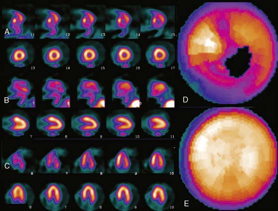
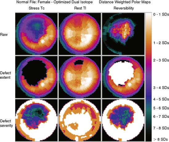
These software packages have become popular because (1) they are automated; (2) they (usually) integrate image display, perfusion quantification, and functional quantification in one package; and (3) they are well validated.25,30,31 Examples of applying three commercial programs to quantify the same patient are shown in Figures 4-3 through 4-5. It is important to understand that the implementation of these programs varies from vendor to vendor. Thus, even though one should expect that the same program will yield the same results given the same perfusion study, the ease and speed of obtaining and displaying results may vary not only between the packages but also from vendor to vendor and between versions of the same program.
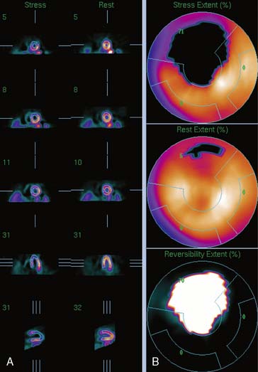
Figure 4-4 Perfusion quantification results obtained from processing the same patient as in Figure 4-3 with QPS. The left side of the figure (A) shows slices from the patient; the top three rows contain short-axis slices, and the bottom two rows show horizontal long-axis and vertical long-axis slices, respectively. The right side of the figure (B) shows the results of quantitation: the stress blackout map (top), the rest blackout map (middle), and the whiteout reversibility map (bottom). Note the similarities of these results compared with those of Figure 4-3.
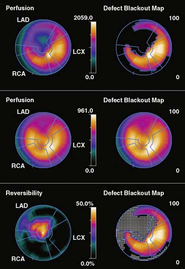
Figure 4-5 Perfusion quantification results obtained from processing the same patient as in Figure 4-3 with Corridor 4DM. The top row shows the quantitated stress (left) and stress blackout map (right). The middle row shows the quantitated rest (left) and rest blackout map (right). The bottom row shows the difference between rest and stress perfusion (left) along with the whiteout reversibility map (right). Note the similarities of these results with those of Figures 4-3 and 4-4.
New Databases
As new acquisition protocols and/or new perfusion tracers become popular, new normal databases must be developed. For example, for ECTb, gender-matched normal databases have been defined21 and validated for the following SPECT protocols:
All protocols used treadmill exercise to stress the patients.
One concern is whether the normal databases developed using patients stressed with exercise can be used for patients undergoing pharmacologic stress. It is evident by looking at these studies that patients imaged after pharmacologic stress have more background activity and more myocardial activity than patients undergoing treadmill exercise. Nevertheless, the relative distributions in normal and CAD patients are similar enough that when the same normal database is used for both forms of stress, it results in similar diagnostic accuracy.33 Although it would be ideal to have separate databases for protocols using pharmacologic stress, the development cost would be prohibitive.
DISPLAY
Polar Maps
Polar maps, or bull’s-eye displays, are the standard for viewing circumferential profiles. They allow a quick and comprehensive overview of the circumferential samples from all slices by combining these into a color-coded image. The points of each circumferential profile are assigned a color based on normalized count values, and the colored profiles are shaped into concentric rings. The most apical slice processed with circumferential profiles forms the center of the polar map, and each successive profile from each successive short-axis slice is displayed as a new ring surrounding the previous. The most basal slice of the LV makes up the outermost ring of the polar map. Figure 4-3 shows polar maps created from applying the CEqual quantification method to a perfusion study.
The use of color can help identify abnormal areas at a glance as well. Abnormal regions from the stress study can be assigned a black color, thus creating a blackout map. Blacked-out areas that normalize at rest are color-coded white, thus creating a whiteout reversibility map.19 This can also be seen in Figure 4-3. Additional maps—for example, a standard deviation map that shows the number of standard deviations below normal of each point in each circumferential profile—can aid in evaluation of the study by indicating the severity of any abnormality.
Polar maps, while offering a comprehensive view of the quantitation results, distort the size and shape of the myocardium and any defects. There have been numerous improvements in the basic polar map display to help overcome some of these problems.15 For instance, “distance-weighted” maps are created so that each ring is the same thickness. These maps have been shown to be useful for accurate localization of abnormalities. “Volume-weighted” maps are constructed such that the area of each ring is proportional to the volume of the corresponding slice. This type of map has been shown to be best for estimating defect size. However, more realistic displays have been introduced that do not suffer from the distortions of polar maps.
Three-Dimensional Displays
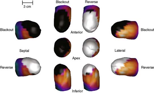
Three-dimensional graphics techniques can be used to overlay results of perfusion quantification onto a representation of a specific patient’s LV. Figure 4-6 displays the same information seen in the polar maps of Figure 4-3, using a 3D representation. In its most basic form, the pixel locations of the maximal-count myocardial points sampled during quantitation are used to estimate the myocardial surface. More sophisticated methods may detect the epicardial surface boundaries of the perfusion scan.16,24,34 These points can be connected into triangles, which are then color-coded similarly to the polar map; details of how such displays can be created may be found in the book by Watt, for example.35 Such displays can routinely be rotated in real time and viewed from any angle with current computer power. They have the advantage of showing the actual size and shape of the LV and the extent and location of any defect in a very realistic manner. Some studies have shown that the 3D models are more accurate for evaluating the size and location of perfusion defects than polar maps36 or slice-by-slice displays.37
Stay updated, free articles. Join our Telegram channel

Full access? Get Clinical Tree


