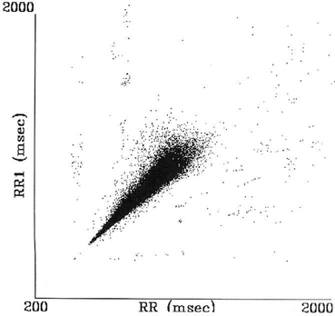
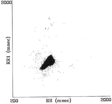
, Chandan Karmakar3, Michael Brennan3, Andreas Voss4 and Marimuthu Palaniswami3
(1)
Department of Biomedical Engineering, Khalifa University, Abu Dhabi, UAE
(2)
Department of Electrical and Electronic Engineering, The University of Melbourne, Melbourne, VIC, Australia
(3)
Electrical and Electronic Engineering, The University of Melbourne, Melbourne, VIC, Australia
(4)
Department of Medical Engineering and Biotechnology, University of Applied Sciences Jena, Jena, Germany
Abstract
Poincaré plot is a geometrical representation of a time series in a Cartesian plane. Points of the plot are duplets of the values of the time series and the distance (in number of values) between values of each duplet is the lag of the plot. Statistically, lag-1 Poincaré plot displays the correlation between consecutive samples in a graphical manner. It has been shown that Poincaré plot reveals patterns of heart rate dynamics resulting from nonlinear processes (Tulppo et al., Am. J. Physiol. 271:H244–H252, 1996; Brennan et al., IEEE Trans. Biomed. Eng. 48:1342–1347, 2001). The lag-1 RR interval Poincaré plot, a two-dimensional plot constructed by plotting consecutive RR intervals, is a representation of RR time series on phase space or Cartesian plane (Liebovitch and Scheurle, Complexity 5:34–43, 2000). It is extensively used for qualitative visualization of physiological signals. Poincaré plot is commonly applied to assess the dynamics of heart rate variability (Tulppo et al., Am. J. Physiol. 271:H244–H252, 1996; Acharya et al., Med. Biol. Eng. Comput. 44(12):1031–1051, 2006; Tulppo et al., Am. J. Physiol. 247:H810–H816, 1998; Toichi et al., J. Auton. Nerv. Syst. 62:79–84, 1997; Hayano et al., Nephrol. Dial. Transplant. 14:1480–1488, 1999). The quantitative analysis of Poincaré plot predominantly means the mathematical characterization of the shape of the plot. In the following sections we will discuss both the qualitative and quantitative techniques of Poincaré plot for analysing HRV signal.
2.1 Introduction
Poincaré plot is a geometrical representation of a time series in a Cartesian plane. Points of the plot are duplets of the values of the time series and the distance (in number of values) between values of each duplet is the lag of the plot. Statistically, lag-1 Poincaré plot displays the correlation between consecutive samples in a graphical manner. It has been shown that Poincaré plot reveals patterns of heart rate dynamics resulting from nonlinear processes [111, 112]. The lag-1 RR interval Poincaré plot, a two-dimensional plot constructed by plotting consecutive RR intervals, is a representation of RR time series on phase space or Cartesian plane [113]. It is extensively used for qualitative visualization of physiological signals. Poincaré plot is commonly applied to assess the dynamics of heart rate variability [111, 114–117]. The quantitative analysis of Poincaré plot predominantly means the mathematical characterization of the shape of the plot. In the following sections we will discuss both the qualitative and quantitative techniques of Poincaré plot for analysing HRV signal.
2.2 Visualization of HRV Using Poincaré Plot
The visual analysis of Poincaré plot is termed as qualitative analysis technique. In HRV analysis, the qualitative technique was first used to visualize the complex HRV pattern which could be produced by alterations and interactions of autonomic and cardiovascular systems accompanying heart failure [91]. The result of qualitative analysis provides additional information to the standard time-domain analysis of HRV signal. It introduced the use of Poincaré plot to characterize the pattern of RR intervals of a healthy heart. Moreover, the visual analysis of RR intervals used to distinguish patients with advanced heart failure from healthy individuals [91].
Comet
Torpedo
This indicates that the change between consecutive RR intervals is minimal. However, this minimal deviation does not indicate the fixed heart rate but suggests gradual change in heart rate while maintaining small beat-to-beat variability (Fig. 2.2) [91].
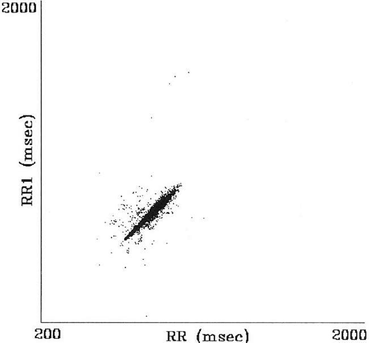

Fig. 2.2
Poincaré plot of RR intervals of heart failure patient with torpedo pattern. Figure adapted from Woo et al. [91]
Fan
Complex
This pattern creates stepwise clusters of points with distinct gaps between the clusters. The stepwise change in RR intervals represents lack of graded relationship between successive RR intervals and linked to nonlinear behaviour (Fig. 2.4) [91].
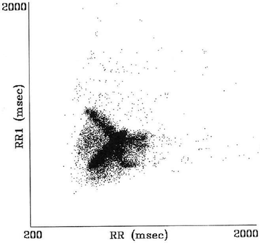

Fig. 2.4
Poincaré plot of RR-intervals of heart failure patient with complex pattern. Figure adapted from Woo et al. [91]
2.3 Quantification of Poincaré Plot of RR Interval
Quantitative analysis of Poincaré plot quantifies the differences among the shape of the plots. It is a mathematical approach to characterize the plot. The RR interval Poincaré plot typically appears as an elongated cloud of points oriented along the line of identity ( ). Hence, the shape of the plot is measured as the dispersion of points perpendicular to the line of identity, termed as short-term variability, and along the line of identity, termed as long-term variability [89, 111]. Approaches of quantifying Poincaré plot are described in the following sections.
 ). Hence, the shape of the plot is measured as the dispersion of points perpendicular to the line of identity, termed as short-term variability, and along the line of identity, termed as long-term variability [89, 111]. Approaches of quantifying Poincaré plot are described in the following sections.
2.3.1 Ellipse-Fitting Technique
Most researchers have adopted the ellipse-fitting technique to characterize the Poincaré plot mathematically as shown in Fig. 2.5. The major axis of the fitted ellipse is aligned with the line of identity, line passes through origin with slope  , and the minor axis is perpendicular to the line of identity which has a slope of
  and passes through centroid of the plot. Hence, the major and minor axis of the fitted ellipse can be expressed as

and

where RR represents the RR interval series used in the Poincaré plot and  represents the mean value of RR interval series. In the ellipse-fitting technique, the dispersion of the points along minor axis measures the width of the plot, whereas the dispersion of the points along the major axis measures the length of the plot. The distance of ith point of the plot,
  , from major and minor axis, respectively, can be expressed as
 , and the minor axis is perpendicular to the line of identity which has a slope of
  and passes through centroid of the plot. Hence, the major and minor axis of the fitted ellipse can be expressed as
(2.1)

(2.2)
 represents the mean value of RR interval series. In the ellipse-fitting technique, the dispersion of the points along minor axis measures the width of the plot, whereas the dispersion of the points along the major axis measures the length of the plot. The distance of ith point of the plot,
  , from major and minor axis, respectively, can be expressed as
